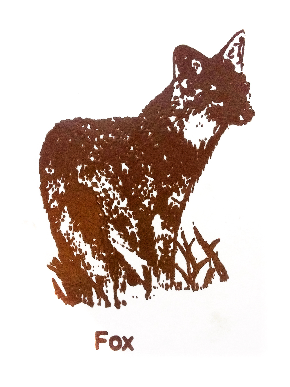
I have had a long fascination with United States Park Service signage, and this weekend this icon above caught my eye. It was part of a sign at the trailhead of Alderfer/Three Sisters Park in Colorado, offering hikers explanations on the animals they may encounter. The signage is a representation and a visual liaison to places and ideas that are a favorite for me and many others. (Think dozens of coats of brown and cream paint, white routed letters, the arrowhead emblem. [Example.]) In addition, many of the original designs have, for the most part, not been significantly updated since the Park Service’s Creation.
While the environmental designs and materials vary according to each park’s geographic local, the signage doesn’t much, and has not for the last century. Whether for budgetary, bureaucratic, or just simple logistical reasons, the signage and much of the artwork that has come to be the man-made interfaces with the nation’s natural assets have not changed, and I am happy for that. So often, too much thought is given to keeping identities current with trends. Perhaps for the job securities of people like me, marketing and graphic firms have sold beautiful and long lasting brands an ‘upgrade’ that was not needed. Updates are seldom an improvement in my experience and only sacrifices one thing no color palette or typographic system can honestly create: real history, heritage, and authenticity.
I am also intrigued with the U.S. Park Service system because it is a beautiful example of a lack of clear and consistent style guidelines. The parks have, very un-deliberately I sense, created a wonderful blend of uniformity mixed with local visual vernacular has evolved from decades of practical, no-(or very little) nonsense pragmatism. I am sure that while there are very many smart and capable people who have contributed to the U.S. Park Services signage throughout the years, I bet many if not most who had hands-on involvement of the creation and installation of the signage and communication were not trained graphic designers; they were doing the best they could with what they were given.
In a larger sense, this aesthetic is very appealing to me. I cannot speak for everyone, but for me, the pendulum is swinging quickly back away from the polished, the perfect, the tidy, the sleek, and the upscale. (For me personally, it was never far in that direction anyways.) Perhaps this speaks to the age we are in; the economic and political climate that we are in is one of distrust for smiling faces, white collars, for establishment, for pre-fabricated communication of all types. Perhaps these current sentiments manifest for me visually – the most visceral way I can sense. Maybe this notion is my own visual libertarianism: how, for what reasons, and under what circumstances things were made are as important that what is made. When things are made in earnest and by people on their own, there is an inherent quality that cannot be replicated, and be damned to those that try to fake it.
A guy named Clay Shirky recently published a book called Cognitive Surplus: Creativity and Generosity in a Connected Age. In it, he discusses how his early bet that do-it-yourself webpages and websites (like Geocities) would fail, because not all people have the skills or talents to ‘successfully’ design their own online web-pages and would learn this quickly, and thereupon turn to professionals to handle the task for them. In the book, he states:
“I was certain GeoCities was going to fail. I’d seen the amount of work that went into designing a usable website… I knew that a bunch of amateurs could not even approximate the quality of what professional designers were creating. No one would want to have their own mediocre page when there was all this professional work being put on the Web at the same time. I was right about the design quality on GeoCities, but I was wrong about the popularity…
What I hadn’t understood is that design quality is not the sole metric for a Web page… other qualities like the satisfaction of making something on your own, or learning while doing can trump it. People don’t actively want bad design, it’s just that most people aren’t good designers. But that’s not going to stop people from creating things on their own. Creating something on your own, creating something personal, even of moderate quality, has a different kind of appeal than consuming something made by others – even something of high quality. I was wrong about GeoCities because I thought that amateurs would never want to do anything other than consume. That was the last time I ever made that mistake.
This type of ethos, the “do-it-yourself”, visual libertarianism breed of aesthetic is rewarding for both the sender and the receiver. Shirky also explains in his book how the made-for-magazine-picture-perfect and professionally designed experiences (home kitchens are his example) are far less inviting than ones which are a less orderly, less immaculate and not so new and squeaky clean. “Which kitchen would you be more willing to walk into and help cut carrots?” he asks. He opens this section of the book by writing, perhaps most succinctly:
“The feeling of ‘I did this myself, and it’s good’ often beats the feeling of ‘professionals did this for me, and it’s perfect.’.
We each define our own definition of the idealized form. Increasingly, I have felt oversold and pandered to in the visual marketplace. Selling me on new definitions of cleaner, brighter, easier, professionaler, perfecter, and happier is becoming increasingly tone deaf to my eyes and ears. What has worked will usually always work, what is made as best it can, by those who need it, will always be remarkable to me.